
3 Showit Canvases: The Homepage Strategy That Converts

Your website homepage is the most valuable piece of real estate in your creative business. It’s the moment of truth where a potential dream client decides if they’ll stay and connect, or click away and forget you.
The mistake many creative entrepreneurs make is treating the homepage like a beautiful digital gallery. But a high-converting homepage isn’t a gallery; it’s a carefully engineered sales funnel. It has one job: to quickly validate your visitor’s feelings, establish trust, and guide them to their next step.
Because Showit allows you complete control over your canvasses, we’re going to stop designing based on what looks pretty and start designing for strategy and connection.
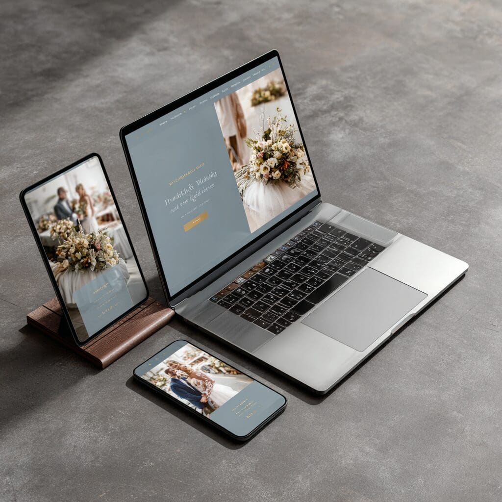
If this is the first time that we are meeting, let me introduce myself. I’m Gina and I’m a brand strategist and ShowIt web designer at Mosaic Brand Studio. When I opened my photography business, I was lost as to what to add to my website so that I could reach my ideal client. Through the years I learned that there are three main canvases that you need on your website to transform your Showit homepage from a portfolio into a powerful conversion machine.
Canvas 1: The Connect Canvas (The Instant Hook)
This is the content “above the fold”—the very first thing your visitor sees before they scroll. You have approximately three seconds to hook them, so this canvas is all about clarity and emotional validation.
Goal: Instant Validation & Clarity
The Connect Canvas must answer two questions immediately
- Am I in the right place? (Validation)
- What Problem can you solve for me? (Solution)
| Element | Strategic Purpose |
| Headline (Unique Value Proposition | Must be client-focused. Use language that speaks to their desired transformation, not your service. Example: Instead of “I offer creative design services,” use “I design authentic brands that consistently book dream clients.” |
| High-Impact Visual | Your strongest, most captivating image or video. It must instantly align with the aesthetic and style of your Ideal Client. |
| Primary CTA Button | A single, clear call-to-action (CTA). Don’t offer five options. Direct them to the next logical step, usually your Services/Investment page. |
Pro Tip: Since 70% of traffic is mobile, design this canvas for the mobile view first. Ensure your headline and CTA are immediately visible without any scrolling.

Canvas 2: The Credibility Canvas (The Trust Builder)
Once you’ve validated the client, you have to establish authority. This mid-page section acts as a crucial bridge, linking the problem they have to the expertise you offer.
Goal: Establish Authority and Relatability
This canvas should make your client feel, “Okay, she understands my struggle, and she has proven she can solve it.”
- Who You Serve: Use a short, powerful statement that explicitly calls out your Ideal Client and the specific niche you serve. Example: “Designed exclusively for passionate wedding photographers ready to double their rates.”
- Social Proof (Proof of Transformation): This is non-negotiable. Feature 2-3 high-impact client testimonials or logos of press/media where you’ve been featured. Don’t just include a quote; include the client’s name and face (if possible) for maximum authenticity.
- The Process Preview: Summarize your core process in 3 easy steps. This eliminates anxiety by showing clients exactly what happens next. Example: 1. Discovery Call, 2. Strategic Build, 3. Launch & Support.
Pro Tip: Use bold icons and clean typography here. You want the text to be scannable, allowing clients to digest your credibility in seconds.

Canvas 3: The Conversion Canvas (The Clear Next Step)
This is the bottom third of your homepage, designed to ensure no client leaves without an opportunity to connect with you—regardless of where they are in the buying process.
Goal: Eliminate Objections and Guide Action
The final section eliminates any lingering doubts and ensures the client knows exactly what to do next.
- Clear Path for Different Client Stages: Offer a primary and a secondary CTA block.
- Primary (Ready to Book): A large button linking directly to your Services or Contact page. (e.g., “See Investment & Book”)
- Secondary (Not Quite Ready): A visual call-out for your Lead Magnet (e.g., “Grab the Free Brand Voice Guide”). This turns a bouncing visitor into an email subscriber.
- Final Trust Element (FAQ/Personal Sign-Off): Include a short, punchy FAQ snippet to eliminate common last-minute objections (like “What’s your typical timeline?”). Alternatively, sign off with a personal note from you (Gina), driving home the human connection.
Pro Tip: Never let your client scroll to the footer without a dedicated, eye-catching CTA button. The footer is for navigation; this canvas is for conversion.
Ready to stop treating your homepage like a pretty gallery and start making it your 24/7 salesperson? By strategically mastering these three canvases in Showit, you’ll start attracting and converting your dream clients with confidence.
Dive deeper into building your website’s strategic foundation with our comprehensive guide: The Creative’s Guide to a High-Converting Showit Website


Discover Your Brand's Voice:
A Quick-Start Prompt Guide.
close
In the world of creative business, your voice is your most powerful tool. It’s what transforms a follower into a friend and a transaction into a true connection.
I created this guide to give you a clear starting point—to help you stop guessing and start speaking with confidence and purpose.

Be the first to comment