

The Photographer’s Guide to Choosing Brand Colors (and Why It Matters)
Choosing your brand colors can feel like a guessing game. Should you pick what looks pretty? Your favorite color? Or what everyone else in your industry is using? As a photographer, this decision feels especially important—and it is. Your brand colors are more than just an aesthetic choice; they are a powerful, silent language that communicates your personality, values, and purpose to your clients in an instant.
If we haven’t met, my name is Gina and I’m the founder of Mosaic Brand Studio. I wrote this guide to demystify color psychology and help you build a color palette that perfectly reflects your photography brand. This is an important and tangible way to express the core identity you’ve already defined, from your ‘why’ to your unique differentiator.
What Feelings Do Your Colors Evoke?
Before choosing a color palette for your business, it’s essential to understand the emotions and associations it triggers. In essence, the right brand colors can build instant trust and connection, while the wrong ones can send a confusing or conflicting message.
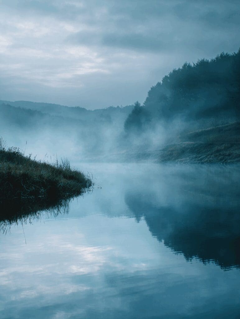
Blue: Trust, calm, stability, and intelligence. Blue is a common choice for brands that want to be seen as reliable and professional. It’s often associated with corporations, technology, and health.
For Photographers: Ideal for newborn, fine art, or professional headshot photographers who want clients to feel at ease and confident in their skill. It suggests a reliable, calming presence.
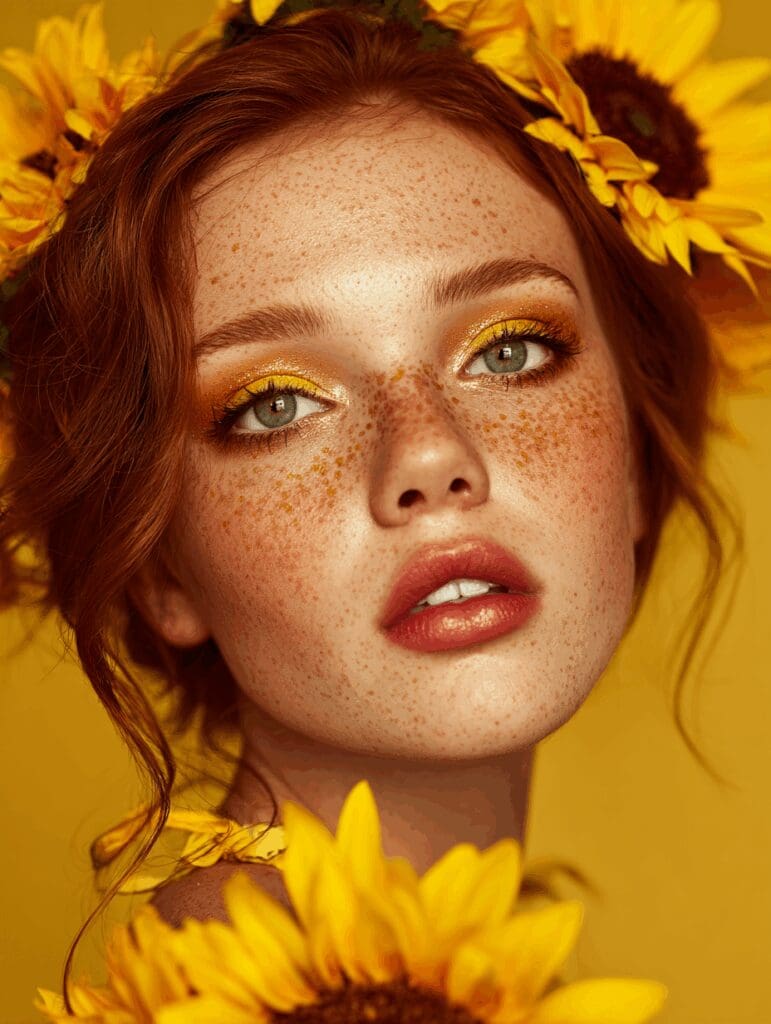
Yellow: Optimism, happiness, creativity, and cheerfulness. Yellow is a warm and welcoming color that grabs attention and radiates positivity.
For Photographers: A great choice for family photographers, lifestyle content creators, or lifestyle brand photographers who want to convey joy, authenticity, and an approachable feel.
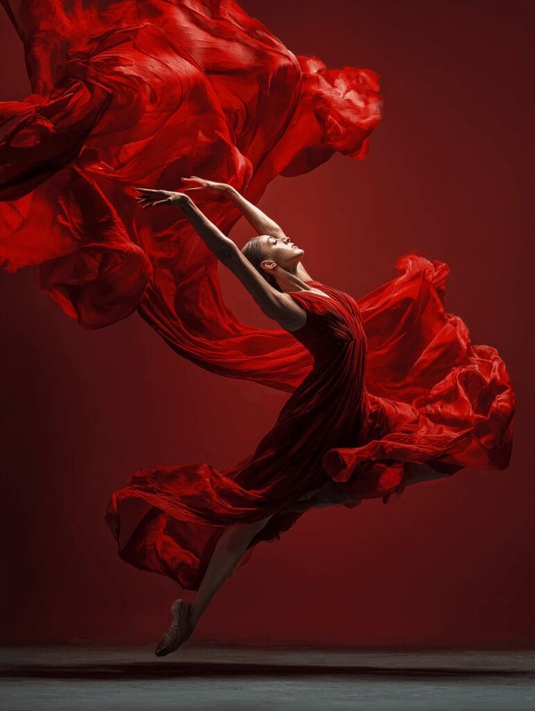
Red: Passion, energy, excitement, and urgency. Red is bold and demands attention. It’s a great choice for brands that want to stand out and create a strong, emotional reaction.
For Photographers: Perfect for wedding photographers, commercial product photographers, or boudoir artists who want to evoke passion, high energy, and a bold, powerful style.
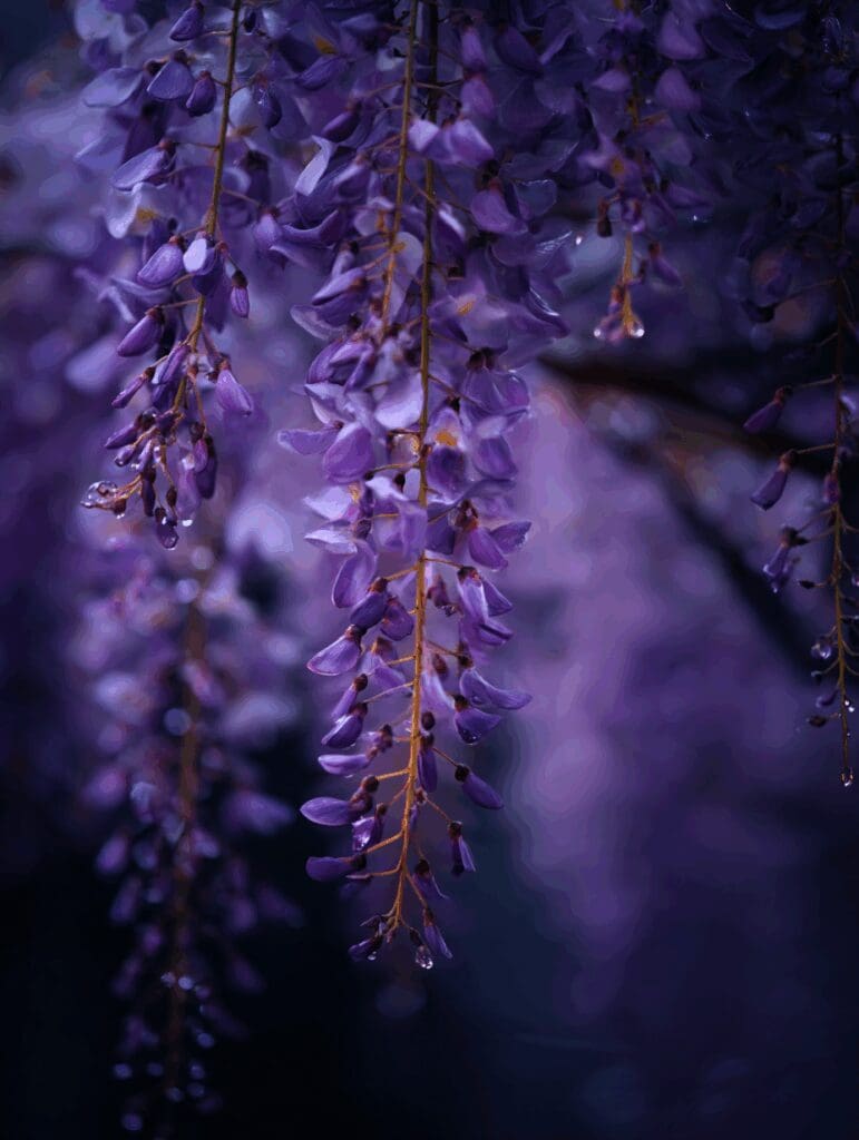
Purple: Creativity, luxury, royalty, and wisdom. Purple is often associated with magic and imagination. It’s a sophisticated and unique color that can make a brand feel exclusive and high-end.
For Photographers: A perfect fit for fine art portrait photographers, high-end boudoir, or photographers specializing in creative conceptual shoots. It communicates artistry and a unique, luxurious experience.
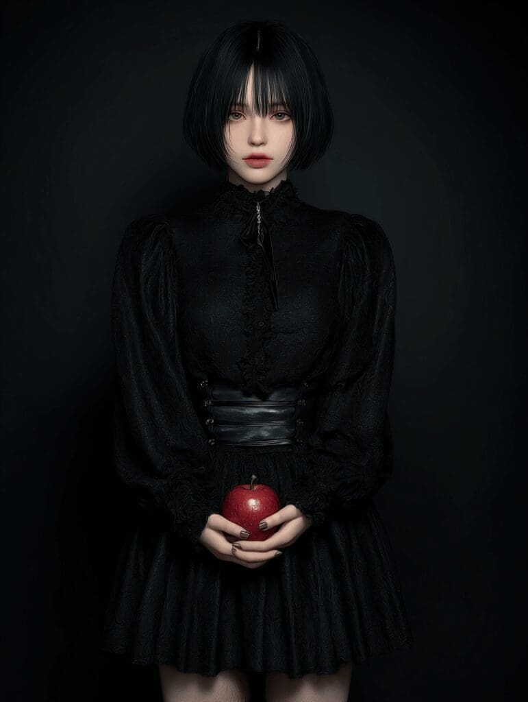
Black: Sophistication, power, elegance, and authority. Black is a timeless and classic color that exudes professionalism and strength. Also, when used well, it can make a brand feel premium and luxurious.
For Photographers: Ideal for black and white film photographers, editorial fashion photographers, or a commercial studio that wants a sleek, powerful, and minimalist feel.
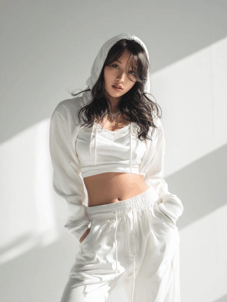
White: Simplicity, cleanliness, clarity, and purity. White is often used as a neutral base to create a minimalist, modern aesthetic. It allows other colors and content to stand out.
For Photographers: Best for minimalist photographers, newborn or maternity photographers, or artists who use a lot of light and airy tones in their work. It suggests a clean, uncluttered style.
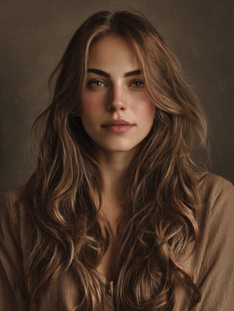
Neutrals (Gray, Tan, Brown): Stability, warmth, and groundedness. Neutrals are essential for a balanced palette. They can make a brand feel organic and approachable.
For Photographers: Great for portrait photographers who focus on natural, authentic connections, or for brands that specialize in rustic, candid, or heirloom-style photography.
Beyond a Single Color: Creating a Palette
Rarely will you use just one color. A strong brand uses a cohesive color palette to create a consistent look and feel across all platforms. Here’s a simple way to build yours:
- Choose a Primary Color: Select one main color that best represents your brand’s core personality and purpose. This color will be most prominent.
- Add a Secondary/Accent Color: Pick a second color that complements your primary color. This might be a contrasting color to grab attention or a harmonious one to create a calming feel.
- Incorporate Neutral Tones: Use neutrals like black, white, gray, or tan to ground your palette and create balance. These colors are essential for things like text, backgrounds, and negative space.
- Consider Your Ideal Client: Always ask yourself: “What colors will my ideal client be drawn to?” Your palette should resonate with them and make them feel a certain way.
Putting It All Together: Your Brand’s Palette
Now that you understand the meaning behind colors, it’s time to choose yours. Think back to the foundational work you’ve done on your brand:
- What emotions do you want to evoke?
- What is your brand’s personality (e.g., compassionate, adventurous, witty)?
- What is your core purpose, and what values do you stand for?
Let these answers guide you. For example, a brand focused on “conscious wellness” (green) with a warm, empathetic personality (brown) might choose a palette of green and warm neutrals. A brand that’s “witty and playful” (yellow) and focused on “innovation” (purple) might go for a vibrant, creative palette.
Your color palette is a powerful tool to reinforce your message and make your brand unforgettable.
Ready to bring all the pieces of your brand together?
Your colors are just one part of your brand strategy. Dive deeper into building a cohesive and magnetic brand with our comprehensive guide: The Complete Guide to Small Business Branding for Creative Entrepreneurs.
Leave a Reply


Discover Your Brand's Voice:
A Quick-Start Prompt Guide.
close
In the world of creative business, your voice is your most powerful tool. It’s what transforms a follower into a friend and a transaction into a true connection.
I created this guide to give you a clear starting point—to help you stop guessing and start speaking with confidence and purpose.

Be the first to comment